The Erection of Disposable Arts
「The Origins And Philosophical Principles Of The Founding Of This Online Enterprise, Dood!」
It started when I was working a dead-end job at a dollar store warehouse. Spending eight hours each day walking the aisles of plastic trinkets and off-brand candies gave me more than enough time to spend inside my mind. I was in equal parts awed at the vast and efficient infrastructure I was privy to, and despondent at it all being in service in something so banal. How a Canada-wide system of storage, sorting, and shipping was devoted to a predatory industry that preys on the least wealthy members of our country, selling the lowest-quality products to low-income households, extracting endless amounts of our planet's limited resources in service of refined garbage. If there was anything meaningful in this position, it was provisional, ephemeral, and disposable.
The labour was hard and mindless, but the bosses couldn't watch me all the time. I took every unsupervised opportunity to read classic literature and books on art studies, with only the occasional industrial accident to get me out of my stupor. One day, I piqued my interest with feminist theory while shitting on company time. I read this excerpt from a screed on labour, saying how women have more economic worth while dancing on a box than at any other point in their life. I sought out books on sexuality and the nature of pornography, downloading them at home and reading them on airplane mode. I was no stranger to these topics, having spent my life enjoying increasingly degenerate forms of omnisexual cartoon porno. But it was the first time I felt there was love in it. It was the first time I felt it noble.
My realizations came daily, the result of terminal boredom and endless self-reflection. How the structure of pornographic works resemble nothing of actual eroticism. How the depictions of sex in mainstream porn are voyeuristic and deliberately uninviting. How the sexuality of our culture exploits the insecurities of adults while woefully misinforming them. How anti-porn activists are batshit insane, taking the side of their oppressors under the guise of equality. How, bluntly, porn sex is bad sex. And if pornography as a theme is unexplored, disrespected, politically oppressed, astonishingly popular, and contradictorily a piece of disposable culture to be thrown away like a cum rag... what else in our culture suffers the same fate?
After a change in management, consistent physical pains, and an impending mental breakdown, I quit my job in spectacular fashion. I stormed out of the office on a Friday, spent the next two days in meditative relief, and when the next Monday rolled around... nothing happened. There was no revolution. Nobody was against the wall. I didn't write a generation-defining manifesto, develop a tech bro crypto grift, or even show hole. Like my bullshit job within the free market's lowest common denominator, my efforts for the next few years were totally transient, creating little projects and volunteering my labour for communities that didn't appreciate it. Everything I seethed about during my job, I didn't work towards fixing when I got out of that hell. And that made me a bigger bitch than I ever was while employed.
But, hey. You're reading this now. And it's totally fair for you to wonder:
How the fuck did we get here?
The words "Disposable Arts" are evocative, exploratory, and nuanced, inviting the listener to ponder the nature of creation and its motivations for existing at all, which is why I ripped it off from a hip-hop album of the same name. Disposable Arts, the album, was released in 2001 by the underground rapper Masta Ace, in reference to his belief that hip-hop culture was being co-opted by mainstream media and diluting its fundamental essence. Part of that includes corny Nathans stealing his ideas for a blog about gay sex.
After the years-long incidence of fucking about and without the requisite finding out, I finally felt it was time to take all my ideas and forcibly expose it to the public. I developed the confidence to dust off my web design skills, make a draft layout, and start coding my shining new blog. I immediately got to work, spent two weeks putting my heart and soul into it, and then forgot about it for nine months while it rotted in my folder titled "plans to take over the world" - alongside my Earthbound-inspired indie RPG about depression, and a book on brony porno.
But after gestating the project for nine months, all my inspiration burst forth from the womb, and I started work to ensure that this project was not stillborn and that it would not be as neglected as this metaphor. It was January 20, and I targeted a February 1 release date, knowing that I had the skill to finish the site in just 12 days. I looked over the Disposable Arts project folder, untouched since my abandonment, and quickly felt comfortable again.
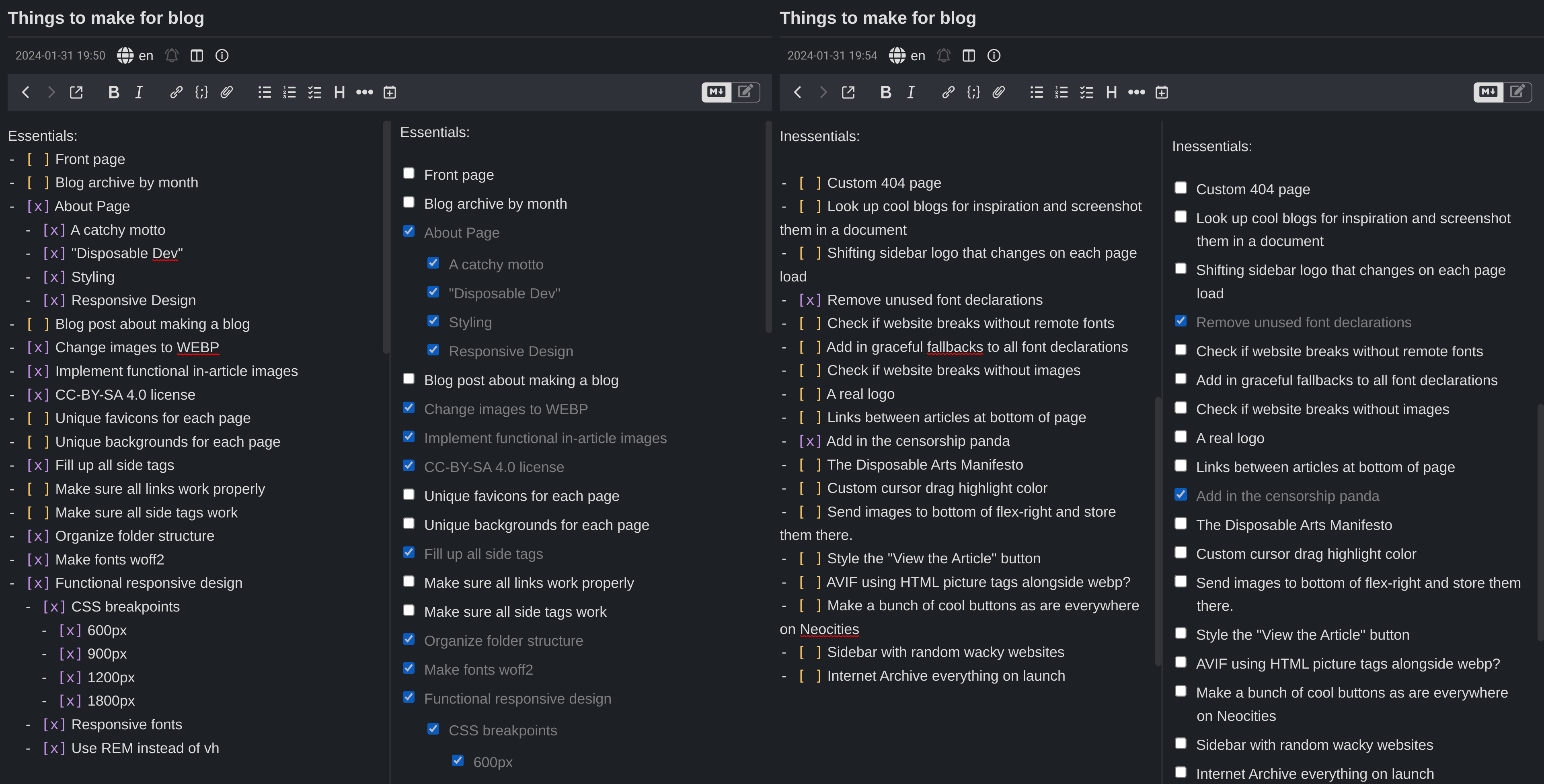
I needed some guidance to manage my expectations and efficiently create the website. So, I made two lists in my note-taking app: essential features for launch, and inessential features I can add whenever. As it turned out, there wasn't much correlation between what was difficult and what was essential. Many features I declared "essential" turned out to be trivial, such as image compression and adding in a license. There are also "inessential" things that, if I were to spend time pursuing them, would have been a significant time investment for little reward. For instance, making a custom logo is something that most people are interested in when they first create their "brand." But pursuing that would have been several hours of brainstorming, and several more hours of putting together logo prototypes. Why would I do that when I can just download some funny fonts and slap it on Disposable Arts?
With that guidance in place, I picked up right where I left off. The style of the website was already created, and I easily constructed more content on this scaffolding. I made it a point to work a little bit on the website every day, making incremental changes so that I was deliberately blind to the enormity of the effort. It was through this that I was able to create the website, finding joy in the process without being overcome by anxiety. Also, my Prozac had started to kick in. Big Pharma made this blog happen.
Limitations breed... sorry, I like that word a lot
In addition to the structure of the website, I made it a point to dictate the themes and tone of the content. There's this YouTube channel named "Every Frame a Painting," which is about film form. I look at a video titled "In Praise of Chairs" and I think to myself, "why the hell would I care about that?". Well, it turned out I did care, and that's how I watched every video on the channel three times. This was no accident. It was a calculated design choice on the parts of its creators, who explicitly said that "a person who watched one video would be more likely to come back and watch another if there was a uniform style - even if they weren’t interested in that specific topic." I'm not going to pretend to be a perfectly professional, internally consistent type of faggot. But I can pretend to write things that people won't skip reading.
I limited the themes of my blog to a handful of specific areas that I know I have competency in, and by making those themes obvious and up-front, I would encourage people to become a regular reader even after they got what they first came here for. That's why I have only seven tags, and why they are always visible on the right side of the screen. This is also why I have gigantic previews on the archive pages, which can hold over 200 words of content. I want people to have enough information to decide if an article is worth their time, even if that means giving them more than the usual clickbait title and a red arrow in front of a young adult male aged 18-24.
After some experiments in the nav bar, I decided to only have seven tags, organized in the convenient acronym "FTP v SAM." You can imagine Serious Sam's war against insecure transfer protocols. Anything more than seven and the brain tends to wash over the choices on display, and if you write about too many things, you become the hobo philosopher accosting strangers outside Walmart. The tags I chose are specific enough so that you can direct your focus to a single area of the site, yet broad enough so that I am not limited by my own lack of imagination. All of them have the theme of being "disposable," and more importantly, they're all my little special interests.
What's also important is what I don't talk about. I don't have an interest in espousing hyper-partisan philosophical issues. Nobody had their entire worldview changed by a sarcastic tweet. But that doesn't mean I'm an enlightened centrist fence-sitter who is complicit in the persecution of my own people (fags, trannies... anyone, really). It is idiotic to make a blog called "Disposable Arts" and not talk about why they are disposable, including the intensely scrutinized behaviour of undesirable minorities. When I do talk about something like politics, religion, or cultural tenets, I bring them up within the broader subject of my main themes, and always with a fair argument to make.
The amount of proselytization I'm willing to do is limited to something like The Simpsons or Futurama, where they definitely had political comedy, but never at the expense of the story. The last thing I want is something like Family Guy or South Park, which is 22 minutes of the writers telling you their opinions. I find that many satirical shows these days don't bother with the pretense of satire and skip straight to attacking their target, which leads to jokes that age as well as the Dole / Kemp campaign.
The tone I apply in my writings was also a concern, because it is quite easy to - excuse my language - fuck that bitch right in the pussy. Now, I am an experienced writer. You don't wake up one day and manually code an entire blog without having a whiskey ginger hangover. (This was before the Prozac.) So you can trust that I'm good behind the wheel, at least on those toy cars that Europeans with DUIs drive. But, we're all guilty of some bitch-fucking once in a while, and tone is the surest sign of the walk of shame.
I knew that Disposable Dev was never going to be for the children. (Adding in the cute and cuddly NC-17 panda is sure to scare the kids off.) I'm a shameless coomer, my existence defies several deities, and I say "faggot" more than a fa/tg/uy in a skub thread. I would allow myself to be as vulgar, rancid, and cunt-slaying as the seven dirty words permitted - including numerous innovations in cunt mathematics since. But, and this is the bitch of the thing, there has to be a point to the vulgarity. I can't just say "fuck fuck fuck fuck penis penis pussy penis dick dick dick dick dick" without there being a sophisticated justification. Often times that justification can just be "swearing is funny," but that slippery slope is how we got Hazbin Hotel.
Like all words, swears are used for a particular purpose - in this case, as an intensifier. When used appropriately intensely, they can either further an existing tone, or create an emotional contrast of tone. When they are overused, they are amateur. With all these attributes, they are no more different than synonyms and homonyms, despite our cultural misgivings towards arbitrarily unclean language. To paraphrase a straight guy with the F-pass: "Your favorite streamer doesn't have to cuss to get subs. But I do, so fuck you and fuck 2views."
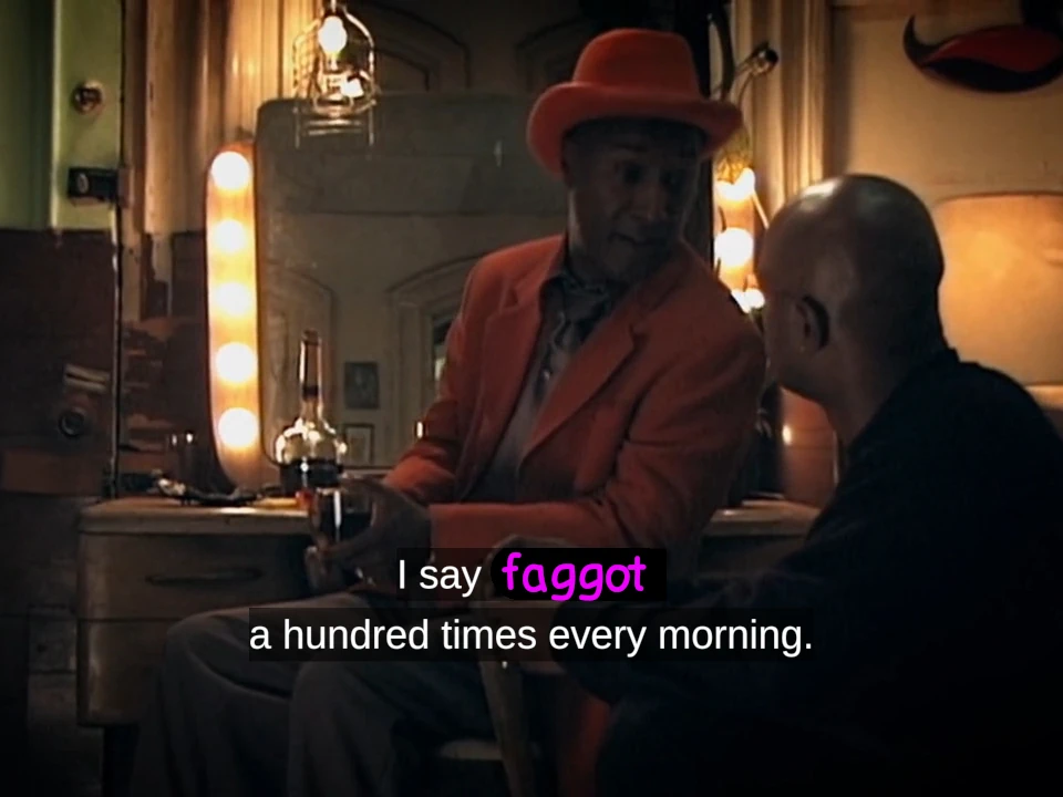
Ultimately, these deliberate choices will alienate some people who would otherwise read my words. But they may also bring forth people who wouldn't bother - a trait I find more valuable on average. I have accepted that my vulgarity is as integral to my writings as William Faulkner's mastery of obtuse sentence structure, Ernest Hemingway's decisive removal of inessential details, or Lewis Carroll's pedophilia. I have also accepted that there is one group of people who will never have anything to do with some of the things I write, another group of people who will be immensely grateful to have some content in those same things, and me in the middle, who's stuck with the dick jokes.
All of this is to say, if you're reading up to this point, thank you... and god help you.
Tag and a leash for a good puppydev
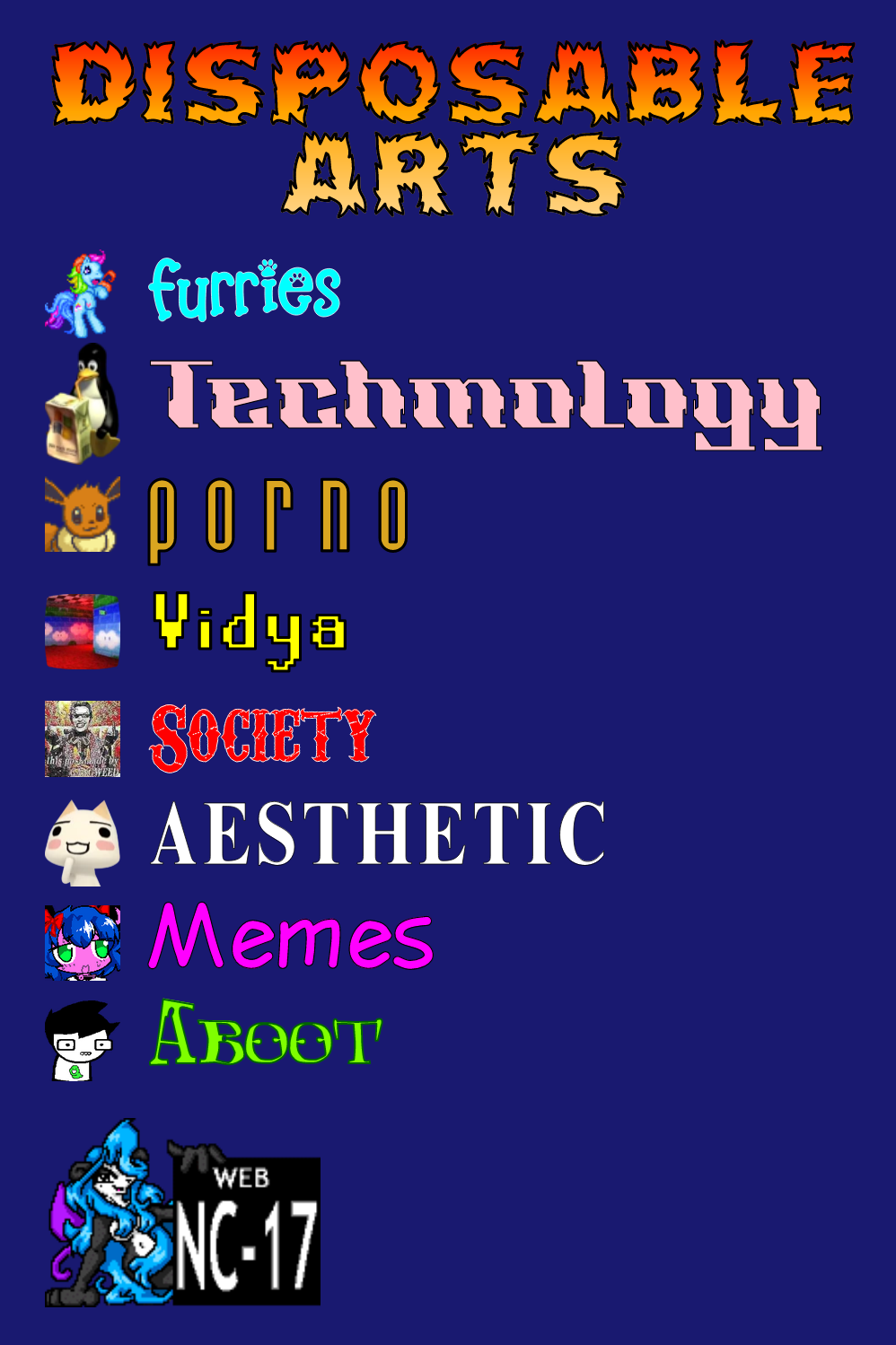
As stated above, creating a small selection of high-quality tags is necessary to prevent decision fatigue. They were designed to not need any introduction. (Oh boy, I wonder what I'll get when I click on "PORNO"!). But I'll introduce them here so as to codify just a few of the many radical messages that you'll be exposed to in the course of this blog. It will also be helpful to my stalkers, who will be happy to point out my many contradictions - like how I used a John Egbert image for the aboot page when I'm clearly Karkalicious.
Furries: A fractal and misunderstood culture, based on the premise that cartoon animals are significantly more appealing than anything we get in real life. Being a furry for a decade makes this an obvious competency, and the endless nuances of animal sex means I will never run out of content. The Rainbow Dash sprite is an ironic nod to the ultimate "I'm not a furry, but..." community.
Techmology: Being a massive dork who unironically uses the words "free software," this is a fitting tag to summarize the most transgender topics in a notoriously condescending field. The primary topics are blatant abuses of technology, incredibly niche discussions about increasingly obscure software, and gay internet drama. The "techmology" thing is a reference to an old Ali G skit which, truly, encapsulates the spirit of human progress. Tux features here sipping that Windows sizzurp, with cute text saying "We suck more! And that's guaranteed."
Porno: As the impetus for this website was reading porn essays on the shitter, it was natural to display my favourite hobby in shameless fashion. You can expect sappy discussions on our personal perversions, and the current cultural trends which indicate we're all bad people for masturbating or whatever the fuck. The Eevee Pokemon creature represents the youth's affinity for feral vulpine sex, with this four-legged fox replacing big-tittied baby-makers by virtue of multi-breasted egg-layers.
Vidya: A massive medium that represents the apex of human technological development, which is used to create underaged gambling platforms and depressed indie devs. The broadness of the subject is limited here to anything obscure, long-forgotten, or "retro" - all descriptors which bring joy to skinny 40-year-old neckbeards. The image represents Super Mario 64 urban legends, with a liminal space for good measure.
Society: A dumping ground for my unhinged political rants? No, but this is my blatant cop-out tag. Without going into the "all art is political" flame bait, the media we consume is influenced by the world the creator lives in. If there is a topic that relies more on exposing this world and less on cheap titillation, then it will likely end up here. The image is a deep-fried Joker meme, because we all... live... in a society...

Aesthetic: The intangible zeitgeist of our current cultural heritage, aesthetic represents both the immediate impact of audiovisual elements and the internal associations we develop as part of our unspoken media literacy. Or, in less pretentious terms, our "vibes." You can expect eulogizations of undefinable beauty, and insufferable hipster bullshit. The image is the Sony mascot "Toro Inoue," who has become known in the underground as a symbol of early-2000s idealism, and for being a fucking hot twink.
Memes: The image is a mashup of two memes: 4chan's [s4s] board's "Bury Pink Gril", which is derived from oekaki futanari porn of Puella Magi Madoka Magica, and the Cookie fandom's "NYN", an adaptation from Touhou Project's Nazrin youkai. If any of this made sense to you, you are so deep into internet culture that you qualify for a government-funded catgirl. And if you're not... welcome to my twisted mind.
Aboot: This isn't a tag so much as a shill, but it's so important that it deserves to be on the sidebar. The about page is essential for introducing the concept of the website in short fashion. As it's the first thing a new reader is likely to view, making this page appealing and easily accessible was a necessary investment for advertising the quality of the content. It's called "aboot" because Disposable Dev is disposably Canadian. The image is "John Egbert" from the acclaimed multimedia extravaganza... Homestuck... and, I don't know, I just think he's neat.
lol you mad cause I'm stylin on you??
It's no mistake that a deliberately silly website needs a deliberately silly aesthetic. The most gratifying part of the blog's creation was building up the stylesheet and getting everything sorted just the way I wanted. All the time spent browsing novelty typefaces, stealing dank memes, and messing with the absolute clusterfuck of getting responsive design working on an iPhone 4... all of it was worth it just to have a salacious Rainbow Dash putting her hooves up in the air, while denying her pegasister heritage by comparing her to funny animal fuckers. Completely different from horse fucking.
However, I knew that if I focused too much on making my layout funny, it would distract from the content within. That's why it was important to have a visual design which was intuitive and non-intrusive, where nothing moves unless you want it to, and where you can read the words without distraction. That's why there aren't any flashing gifs, scrolling banners, or any other hallmarks of Geocities-inspired design. With comedy, it's essential to tell your jokes without getting on the nerves of your audience, and if you're writing on a serious topic, you have to give the audience the opportunity to ignore the silliness. You can't have a warm reception if your reader is distracted by random bullshit.
I knew immediately I wanted a two-column layout, split about 2/3rds and 1/3rd, which ended up being 3/4ths and 1/4th. The left column would host the website's entire content, giving ample room to control the presentational style. The column is backed by a very dark transparent black, which gives contrast to the generously sized typeface. On mobile, this fills the entire screen, but on desktop, the sides are cropped to give a peek at the cheeky anime backgrounds - a quick way to add some additional identity to each page, and violate even more copyrights.
Even though I was using more fonts and colors than a 2012 Tumblog, the most important consideration was the body text. 99% of the text you read will be in one typeface, so it better be a good one. I wanted something that was competent, yet unpretentious, being a little bit cartoony while still being able to take it seriously. I ended up with "Alegreya Sans," which also came with a serif version while supporting small-caps. This wide support was convenient because I was able to use the same typeface for the body text, inline links, and image captions, providing consistent design for the entire left column.
Outside the text, all articles are essentially the same. They have a title, subtitle, tags, and date. They also have some images with accompanying captions, so that I can take funny memes and ruin them with Reddit comments. The title information is in-your-face at the top of the page, but it's easily ignored by scrolling down a bit. The images also have the choice of being sent to the side or front-and-center, which lets you divine the dankness of the meme. In either case, the stylistic choices are the main attraction, where you can inhale the vibe of the site without being subjected to the same cookie-cutter templates on Substack or Medium or some other doomed tech cult. Writers who separate style and substance are idiots. If you have a cunt, then you must serve.
When you've seen these same elements a million times before, it's difficult to differentiate yourself, but focusing on these little details dictates what you value. For instance, I don't put my author credit front-and-center, because it's a violation of Stoic principles, and you already know I'm up in this bitch. I would rather give the reader something they would care about - for instance, a subtitle surmising the article, and whether the article is old enough to dig up and cancel me over.
The right column was simple enough to execute. All I had to do was shove in my blog title and tags, put in a funny image, dress them up in a cool font, and make sure that they stay the same size all the time. The downside to this minimal design is that I can't put much in there without taking up valuable real estate. I need to be disciplined enough to reject 88x31 buttons, advertisements for live girls, and that gif of the guy who peed on everyone from Joseph Stalin to Britney Spears. It's a sacrifice, but it's for the good of the site, and for that guy's bladder.
As you can infer, the layout and styling of the site was more or less a simultaneous project. You need to know what the styles look like in order to inform the page layout, but you can't know how to style the page until you have the layout. The solution to this problem was to do one thing at a time, until I got to the point where I needed the other to fill in the gaps. This meant the fonts, colours, images, and dimensions were building on each other all throughout the process. This allows the website to keep a balance between looking effortlessly fun, while still having sound design principles that remove frustration from viewing it.
As for my blatant disregard of copyrighted materials, I will be astonished if I were to make any money off this enterprise, or be popular enough to be worth suing for those pennies. This does have the wrinkle of making my "CC BY-SA 4.0" license, linked at the bottom of every page, somewhat muddled. Maybe you could save my words as a text file? But then there are websites that let you illegally download tens of thousands of video games for no consequence, so I'm sure The Pokemon Company will overlook my sexualization of their children's franchise.
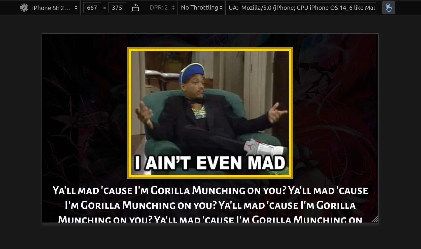
I also wanted to ensure the website adhered to "responsive design," which basically means you make it readable on any screen, especially cell phones. As the browser window changes, you can adjust the size of the website's elements to compensate. There aren't many hand-coded websites that bother to include this. This is because it's tedious to do even if your site's layout is already simple. If your website relies heavily on having a large screen, or is just badly coded, then you're effectively re-engineering your website for a specific use case that you'll never even enjoy yourself. So they instead put up a disclaimer saying that if you view their site on a cell phone, you might as well be browsing on a Nintendo 3DS.
I understand the annoyance of having to do work like this, and how it's a giant "gotcha" that your website is only half-done because it's only functional on a desktop. I also understand the tedium of having to learn an entirely new set of web design skills when they're so alien to the work you would rather be doing. But all of these excuses are lame and tired, and it's an admission of defeat that you didn't care enough to finish the job. There are some very elaborate personal websites that manage this just fine. Just, a, few, examples, for, you, to, browse, through. Resize your browser window if you don't believe me - and, yes, you can even view them at 400x240. The resolution of the 3DS web browser.
Fortunately, the two-column design of Disposable Arts meant that it was simple to adjust it for any resolution. The website goes into "mobile mode" below 1200 horizontal pixels, which is about 720p resolution. This means the right column goes onto the bottom of the page, and sidebar images expand to fill the center. The rest of the work involved adjusting my font sizes for different screen widths, and making sure images don't take over the entire screen. Because of this, the website can be tolerably read at any screen size. Well, except for ridiculously wide resolutions, but if you're viewing my blog on 3 monitors you get what you deserve.
Finally, I will talk about my "aboot" page. I constructed this page from the ground-up, because its design is unique to the site - a centered rectangle with two paragraphs and a single side image. It was designed to be a single-screen summary of the website, and I mostly succeeded. It's entirely self-contained at 1080p, but at resolutions below that, it either goes to "mobile mode" or requires scrolling down. But the point wasn't to make a stylistic gimmick. It was to act as a calling card, which the gimmick is absolutely in service of. People can view this page and decide if they want to engage with the website further. On that basis, I succeeded completely.
There are multiple design elements and coding tricks exclusive to this page. The most substantial trick is that hovering over certain, slightly-brighter words gives a blue underline and gives you additional information. This lets me fit in more jokes in the same space, while rewarding those who are curious enough to engage with the page. In fact, there are over 900 words in the hidden text - 6 times as many as the paragraphs they're hidden in! Sadly, this doesn't work on mobile because you can't really "hover" over an element with your finger. The functionality is still there in mobile mode, but I made every word the same brightness so that you don't think they're links.
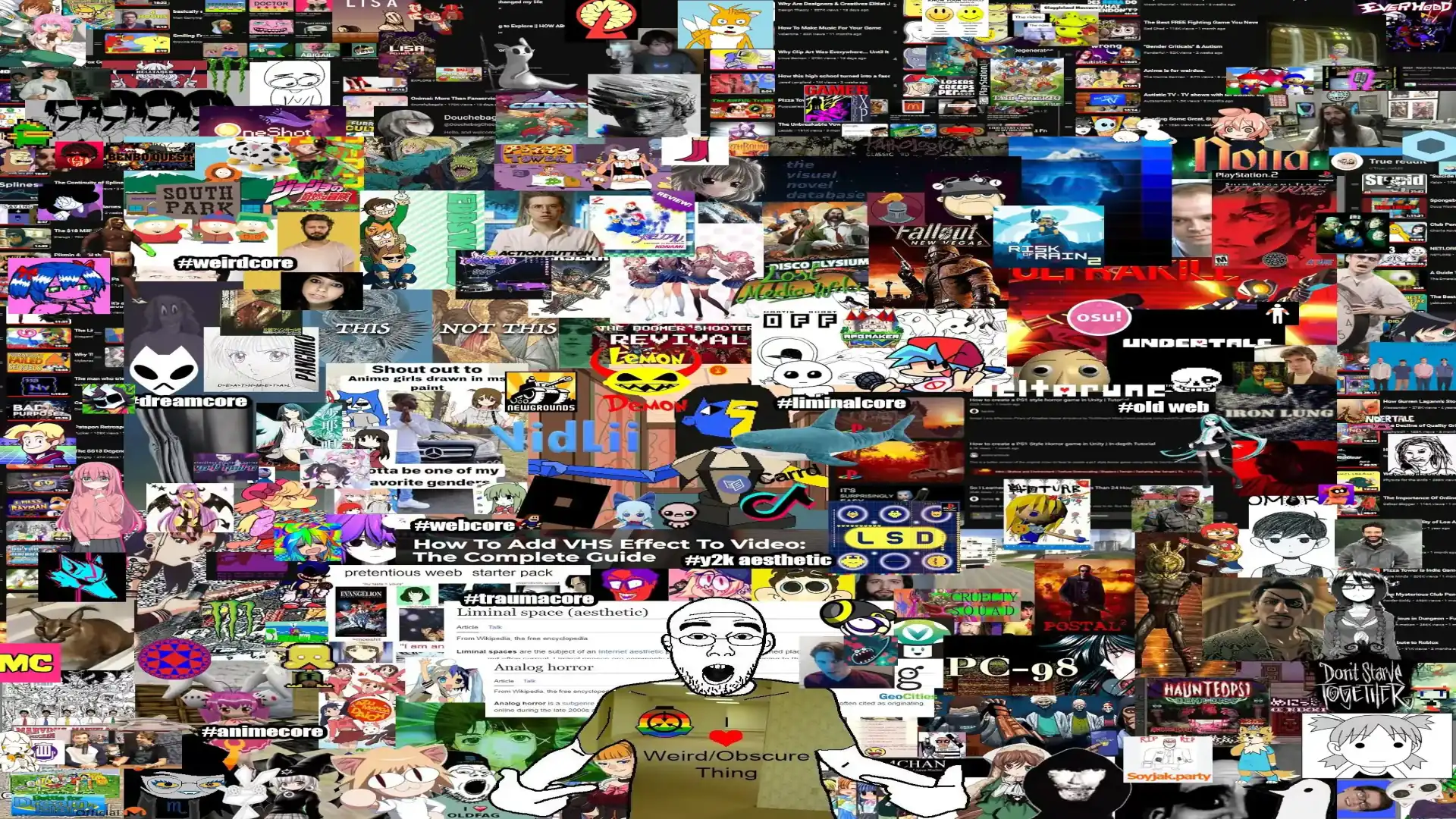
And, finally-finally, I will end this section by showcasing the background for my aboot page, which is... just... incredible.
Disposable Dev vs. Disposable Arts
I've talked about Disposable Art's impetus, its themes, its content, its aesthetics, and the deliberate choices I made to bring it to this point. On first glance, it's strange to talk about these ideas before the website has even launched. How can I say my choices were valuable when I have not yet seen the result of them? Well, you have to make educated guesses about these things. You have to use past experiences to inform the present, even if that involves an uncertain future. And in my case, having my first blog post be about the blog I'm posting on is a delightfully meta experience that conveniently hits on every single one of my competencies.
As it turned out, my self-imposed 12-day deadline was slightly optimistic. I started work with a codebase that already had a prototype article layout. This prototype article and a new front page layout was finished on day 4, with responsive design complete on day 6. The about page was finished on day 10, alongside a transition from the prototype phase to the release candidate phase. This involved adding a license, rearranging the website's file hierarchy, moving away from using test assets, adding in graceful fallbacks for missing assets, efficiently compressing existing assets, and adding in the last bits of "essential" polish. At this point, the website was almost entirely finished, and all I had to do was write an article so that I can create the tag pages and make some final polish.
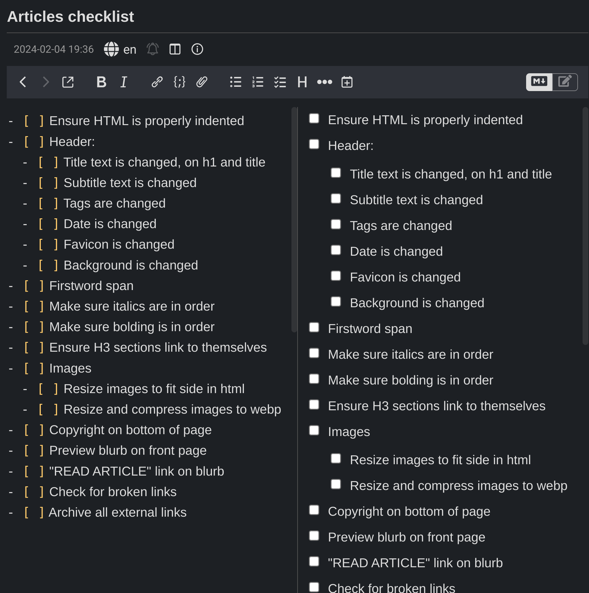
This article, being 6,000 words long, ended up taking 2 days to write, which means it was finished on day 12. So, I met my deadline, right? No, because I still needed to format it for the website through manually converting all the markdown from my notes app to HTML. Since this was my first time publishing something on Disposable Arts, the workflow for this was unoptimized and awful. I ended up with a list of, no joke, 18 different items to check before publication. Each individual item is fairly trivial, such as "make sure you actually put in the article's title," or "make sure you didn't upload hardcore fetish porn." But discovering this inventory of things I have to do, for each and every article, took up an entire day. This is something I will look towards automating for the future, and it's a good thing this was just a one-off time investment.
But even then, I still had to create the tag pages - the literal last thing I had to do for the website. I thought this would just be a copy and paste job, but I neglected to consider the unique things I had to do for the pages: unique markup, titles, backgrounds, favicons, and quality assurance for every page. In the first place, I had to recreate the fonts used on the navbar for the titles on the tag pages. That involved unique styling just for those elements, which meant more code and even more responsive design considerations. Second, I underestimated the difficulty in finding appropriate backgrounds and favicons. They had to fit my criteria of being visually distinct, aesthetically synergistic, thematically relevant, and furthering my hipster cred. It turned out the hardest part of making the tags was stealing images from shady wallpaper sites, and I still don't believe I achieved all my criteria on all the tag pages. But, fuck it. It's good enough.
So, on day 15, I had finally, finally, finished the website. Three days over schedule, and with about a month of total work, Disposable Arts was able to be published. Of course, it's not "finished" insofar as it's an objectively perfect product. Art is never completed - only abandoned. But I achieved the goals I set out to do in approximately the timeframe I chose, and any polish above this is pure bonus. It's hard to say how many hours I spent altogether, but I estimate it was over 40 hours for the 15 day stretch, and maybe 20 hours for the initial 2 weeks. Overall, I could have spent those 60 hours doing two things: creating a website that would offer me an opportunity to express myself in novel ways while offering genuine benefit to everyone who decides to be a part of it, or playing one of those newfangled video games. Such as... Palworld...
The next blog post will be about the technical aspects of making this blog. What I've said here is broad, isn't it? No doubt the dorks among you will be entertained by juicy descriptions of CSS selectors and obscure HTML tags. Poring through revision histories and getting hard-ons for old-school software debates, like which gedit derivative is the best, if Creative Commons licenses are suitable for markup languages, and whether Mercurial really is better than Git despite the entire universe moving past "hg." There is always satisfaction from seeing a project come together - and the sense of smugness for knowing you could have done better.
"Wait a second," you might be saying. "Why did you talk about this elaborate process of working on your website, including a detailed time log of your individual activities across the entire two weeks, dedicated specifically to ensuring that you successfully launched your website on a specific date in February... when the very first article on your website was uploaded in fucking March?"
Because I learned it was a leap year, and I decided to launch on February 29.
See You, Pikachu!
It's not so important who Disposable Dev really is. It's just a persona like any other. There is one human being behind it, but as an author, I don't feel much attachment to praise or credit. The works I make are good enough for me, and if I have achieved excellency through knowing I did the best I could in the moment, then I will have lived nobly. Dev really is Canadian, furry, and genderfluid. None of these are cynical fiction, nor are my past exploits - notwithstanding some artistic license. But my works will survive past me. If they have value to you, then that is as much as our relationship needs to be.
So to everyone who reads this post and is interested in sticking around, I will welcome you warmly. And to those who aren't - well, I think you've already left. I'd be typing at a wall, which I physically am doing right now but then it wouldn't be over the internet and people wouldn't read it and that would be very sad.
As the Disposable Arts motto says: remember what's best left forgotten. I hope that I will be looked fondly upon through rose-tinted glasses. And if I am to be disposed of in the annals of time, you will still have your memories, and that is enough for me to be honoured.
Disposable Arts by Disposable Dev is licensed under CC BY-SA 4.0