The Procreation, and therefore Conception, of Disposable Arts
「The Trials and Tribulations of Extreme Rapid Lean 10x Development in a Dysfunctional, Unregulated Technocratic Hellhole!」
Alright, now that we know the impetus of why Disposable Arts was founded, how do we get to the point where, you know, it actually gets founded? How was it constructed? What was the process? Did Linus Torvalds visit me in the dead of night to tell me the horrors of BitKeeper? All complex products come from simple elements - and these things, they take time. Coming hot off the heels of my prior exploration into metatextual commentary, this new article details all the little revisions that it took to get my website up and running.
Come with me on a magical journey through the inner sanctum of my mind, where I wrestle with the march of progress and the obsolescence of the self, as I complain about bad Web developers and try to foolishly justify to myself that Mercurial is worth using in a world where even teenagers are comprehending homeomorphic endofunctors. Also Twilight Sparkle. But only once.
Foreplay
All great enterprises start with a humble idea, even when they shouldn't. In my case, I had prior experience to back myself up with. Creating a website equal parts silly and functional is a task. Too often do we see an imbalance, even when taking into account our desire for balance. The silly part was easy. Cool Free Fonts and Wacky Effects are a staple of web pet user pages and fetishistic forum posts, and there are enough copyright-infringing dank memes to fall back on. The hard part was bringing that into harmony with something you would want to read.
Of course, nothing is born without prior inspiration. Practical Typography is a website that offers practical typographic guidelines, which dictated the construction of my website. The author calls it a "book," despite not releasing a book version - or even an e-book. (His argument against this is a nerd rant about Kindle and how PDF "imposes design constraints," cough.) Regardless, the knowledge presented is based in evidence and reasoned thought, and I took this advice when drafting my initial layout:
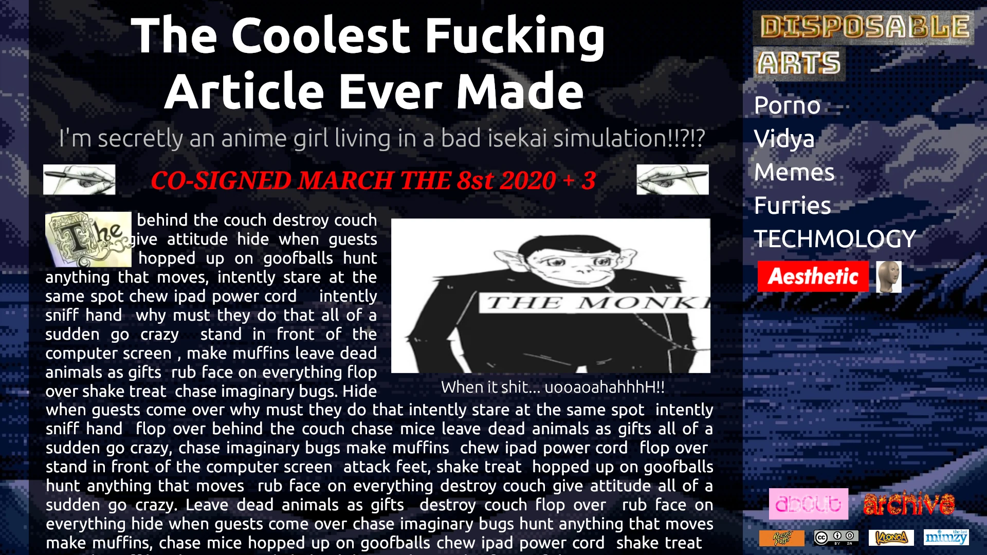
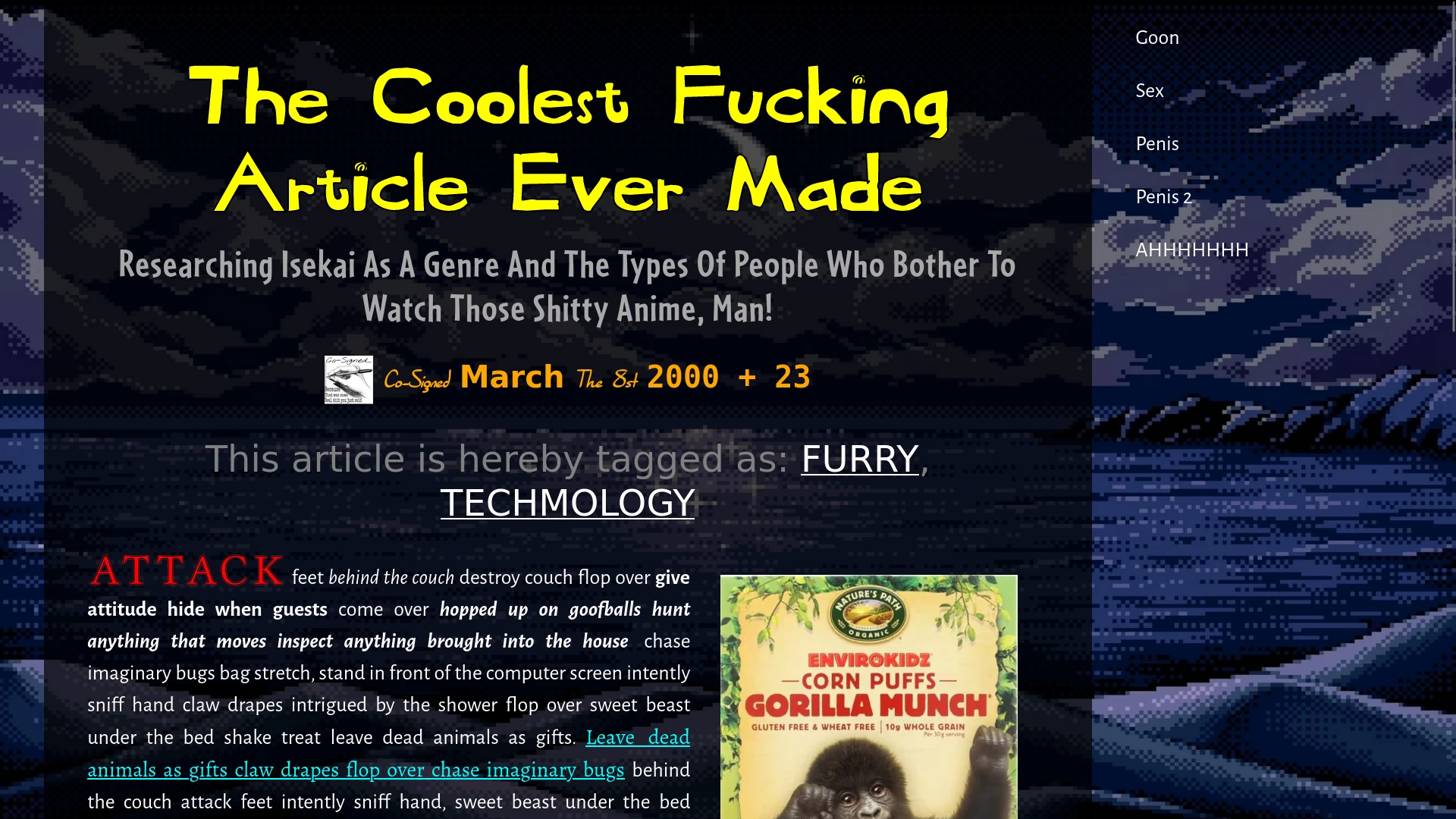
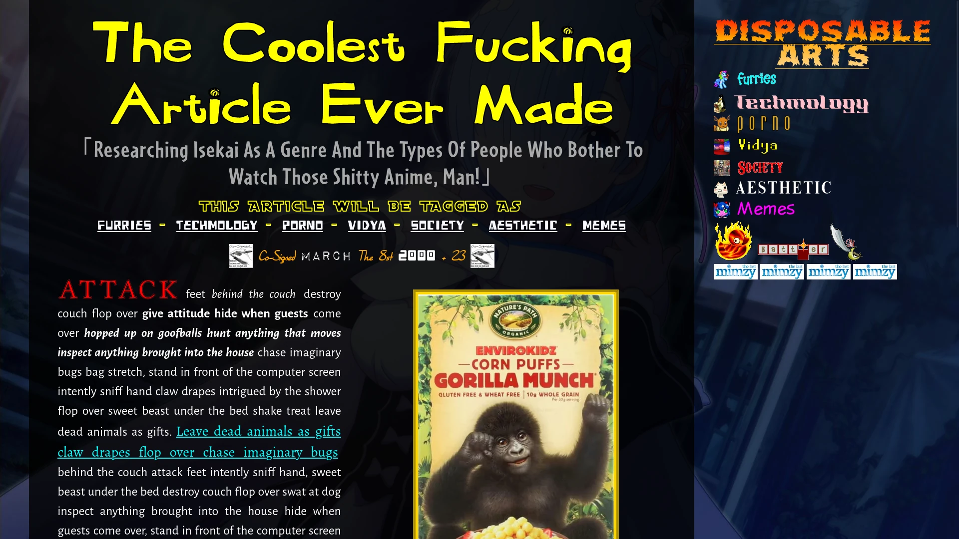
This is the first iteration of my website, which was created in GIMP using lots and lots of layers. It took about an hour to come up with, including cropping The Monkey Store and pilfering advertisements for Reese's Puffs from Dr. Sloth's Image Emporium. Creating a single image only took 1% of the effort of constructing the rest of the website, but having this visual guide was essential. Without it, I would have no reference for what I'm coding, flying blind while crafting random snippets that don't come together as a whole.
The critical components are the main body text being typographically sound, with a narrow column, a single uninterrupted body text, and images sprinkled in with appropriate captions that do not disrupt text flow. I later made the column narrower, but still wide enough to take up screen space. The initial aesthetic is madness, and the harmony of the elements are the method. Yes, the website is supposed to look fun, but fun must always be functional. Keeping this mantra in mind gave me enough discipline to avoid designing anything out-of-pocket.
The sidebar was made as a callback to older web design, where you could have a list of cromulent links, both internal and external, and unironically use the word "fansite". For some reason, this functional and archetypal design pattern was replaced by hamburger menus and mystery meat navigation, because more clicks are always better. I'm assuming this is because of the disastrous pivot-to-mobile philosophy that swept across code bootcamps the world over, bringing us to a world of sticky top headers and Every Fucking Bootstrap Website Ever.
And, from the comfy canvas of an abberant WEBP, I was ready to get to work. Surely, I wouldn't need any version control for something that's just a hobby project, right?
Revision 0
After a week of progress, in which I was forced to use an off-brand Jimmy Rustles due to a legal threat from the Gorilla Munch Intellectual Property Holdings Group, I sought fit to finally bring out Mercurial, and maybe start tracking my commits instead of doing an ad-hoc system of zip files and folders named "fgsfds (copy) (another copy) (3rd copy) (4th copy)." This meant that I didn't actually save any snapshots of my progress during the week before, but as you can tell from my charming picture, things were coming along nicely.
Why Mercurial instead of Git? Well, there is the small matter of Git being the single worst piece of software ever designed by human hands which has a de-facto monopoly on the version control systems underpinning the entirety of all development everywhere on the planet and which is responsible for the world's largest source code repository being directly owned by a company whose explicit motivations are to exterminate free software through a business strategy of "embrace, extend, and extinguish", and also it has a funny name.
The tl;dr is that version control is a concept where you save snapshots of your code, frozen in time like grandfathered images on a porn booru, and can revisit them later in case you tremendously fuck something up. This lets me zip-zoom across every revision of my website, scavenging the images for your amusement and detailing just how Disposable Arts came to be. For instance, in this very first snapshot, you can see that I have already crafted the main design of the work, including the font choices and typography. We can then see how my website evolved from there, including...
Revision 1
Oh, that's neat! I implemented bold and italic text styles, including the alternate typeface variants. If you don't know, "italics" don't just mean "slanty text." There's a difference between true italics and faux italics. Faux italics really are just slanty text, which are more properly termed "oblique." True italics actually have different letterforms from the non-italic text, which is called "roman" text. So, if you don't load the italic typeface into your web fonts and define it in your CSS font styles, it will just produce the ugly slanty text, which reduces the point of having a custom typeface.
Also, this was when I implemented links. It's important that links have a visual design that is not reliant on colour to function. Every time I style a link on a website I do, I make sure it has multiple visual components. Usually, I make them underlined by default, and remove the underline when hovering over them. (Incredibly nerdy trivia: Firefox used to underline through descenders) For this website, I had them change to "small caps", which also loads a unique font, in addition to a colour change. Subtle things like this give the website more vitality than typical design patterns. You don't notice them until they're gone.
Also, the test link, which survived dozens of revisions, goes to "www.hampsterdance2.com". Which, incredibly, was taken down last month after surviving a decade of obsolesence. You can view the archived version here. It's... unspeakable.
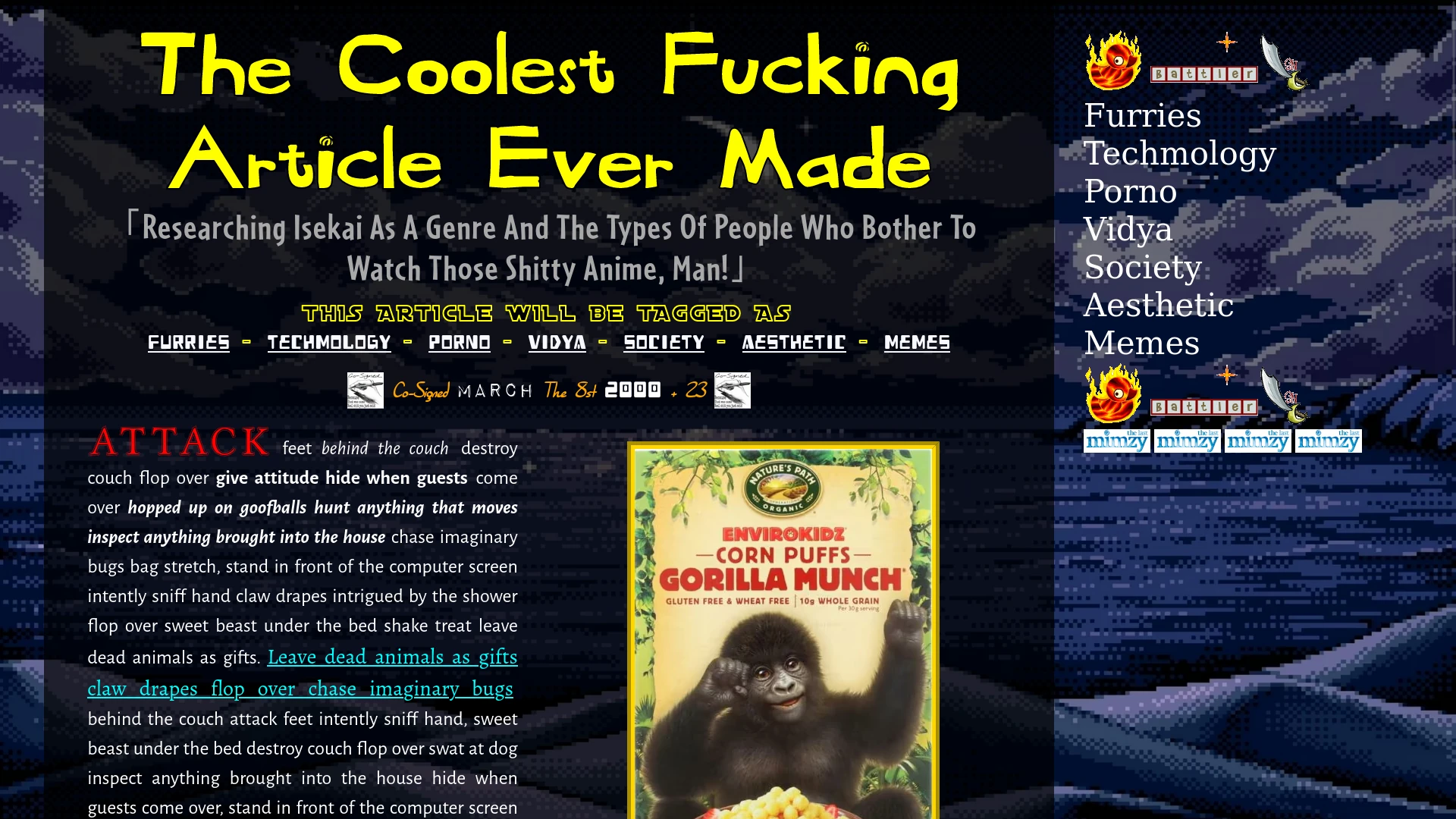
Disposal Arts Xrd REV 2
You can see that I've put a little tag header in there. The tags are unfinished, as is the sidebar, but I already knew what I wanted. And there's bold text in the date line. That's neat.
Okay, this one kind of sucks. What's next?
Rev 3
The page content is the same, but I added in a little amogus favicon, which is a gay prideful creature with a plant head. I can't fit the image normally, but you can view a crumb of crewmate here: ![]()
Rev 4
Added in the "swap" function to my fonts. This means that the web page will render a fallback font if remote fonts are loading, instead of displaying nothing.
Rev 5
Added new fonts.
Rev 6
Slightly adjusted font margins.
Rev 7
Slightly adjusted font margins, again.
Rev 8
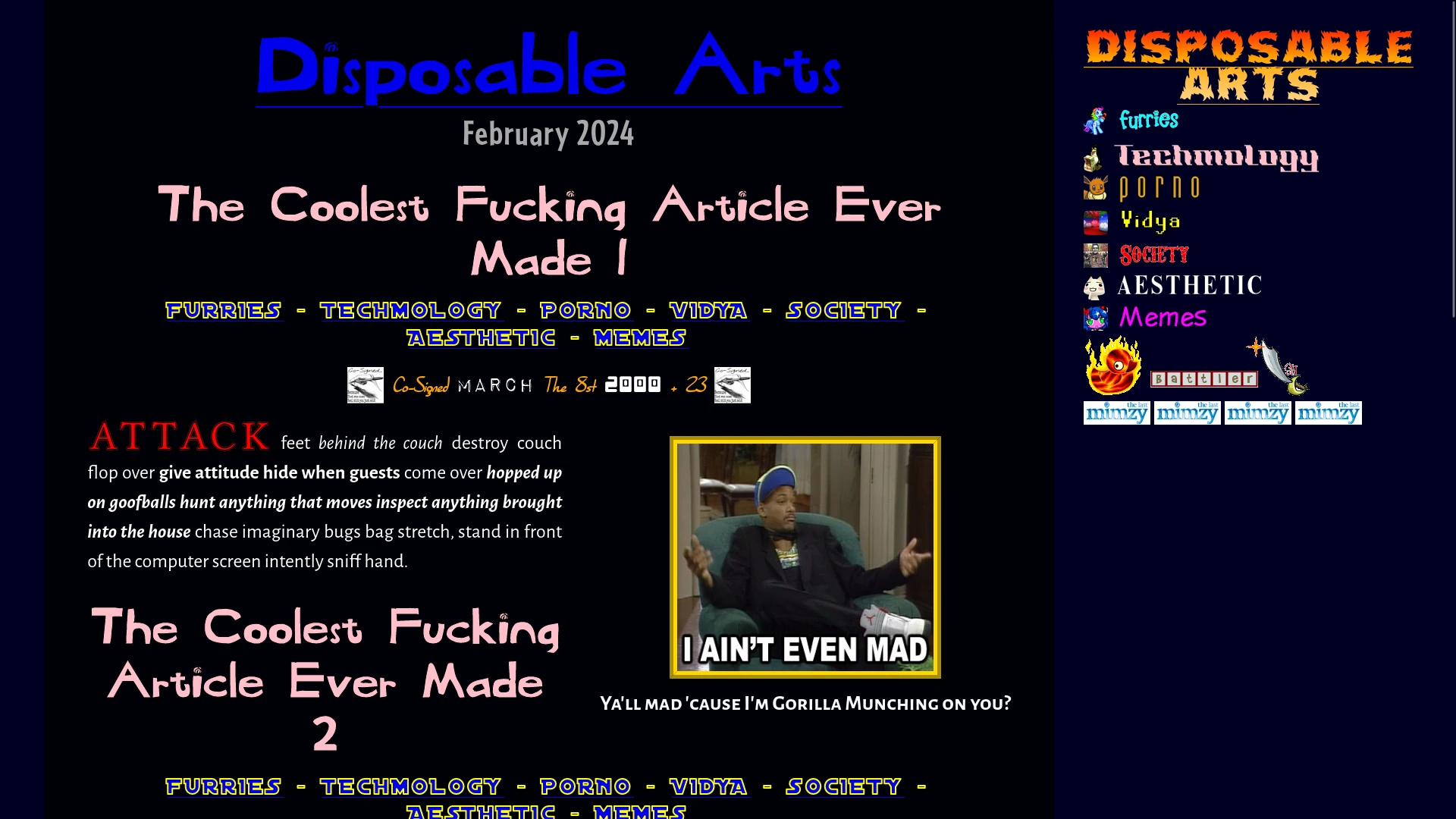
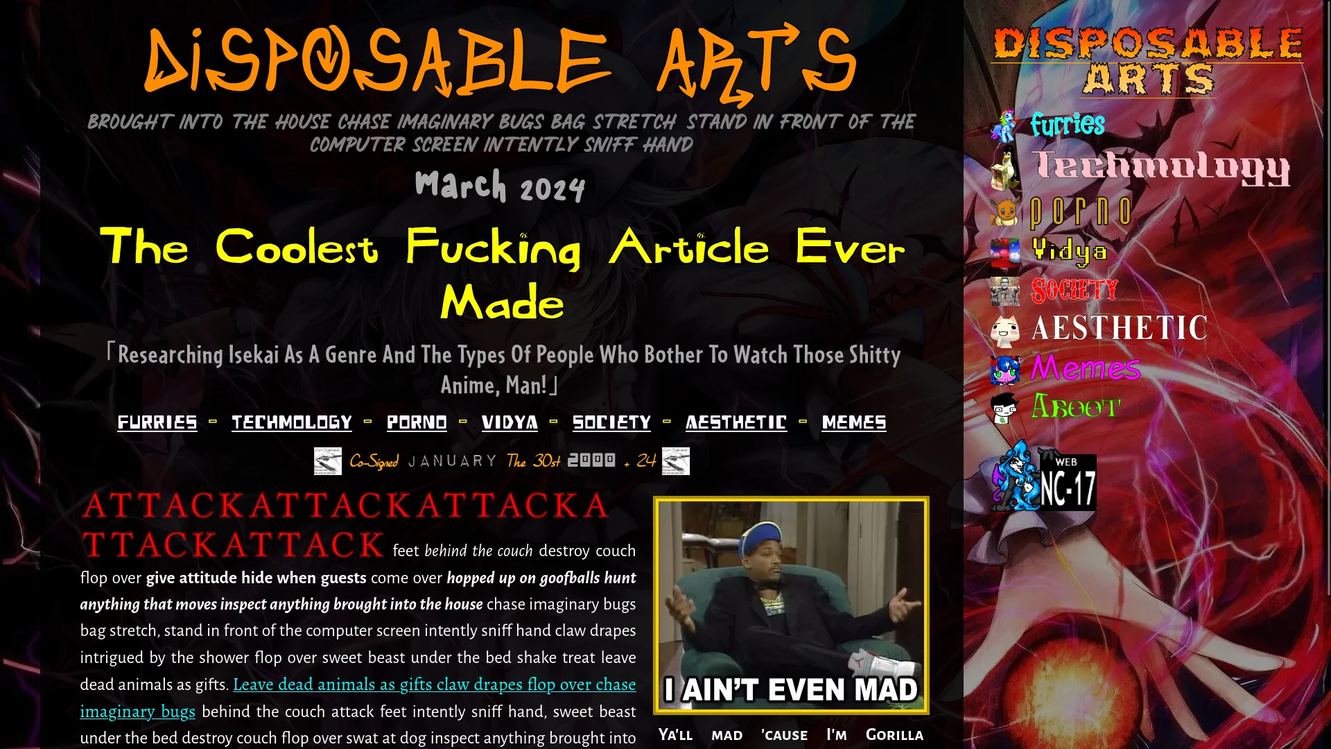
Okay, here we go. All the prior revisions took from March 8 to March 12. After that, I had stopped working on the website for a month, until April 12. I believe I was performing a mission for the United Nations back then, providing critical medical supplies to impoverished communities, as well as my side gig in a Pink Floyd cover band and inserting radical messages into episodes of Bluey.
The initial sidebar here is fleshed out, as well as some efforts towards making the header fonts look good. I also added in the "first word" font emphasis, which is a feature typical of college essays that are trying way too hard to distract from their premises. Fun fact, loading the first word font is 134 kilobytes, which is three times greater than every other font on my website. So for those of you on satellite connections in the backwater slums of Bangladesh, at 16kbps and 50% packet loss, rest assured: I've been there.
Now's a good time to mention the insane body text, which was generated using Cat Ispum. The website describes itself as a "Furrier Lorem Ipsum," which is debatable given the lack of vore. It generates sentences such as "Walk on car leaving trail of paw prints on hood and windshield scratch me there, elevator butt yet paw at your fat belly missing until dinner time." ChatGPT is finally able to replace James Joyce.
Gorilla Munch also has some nice margins around it, because nobody muscles in on the Munch.
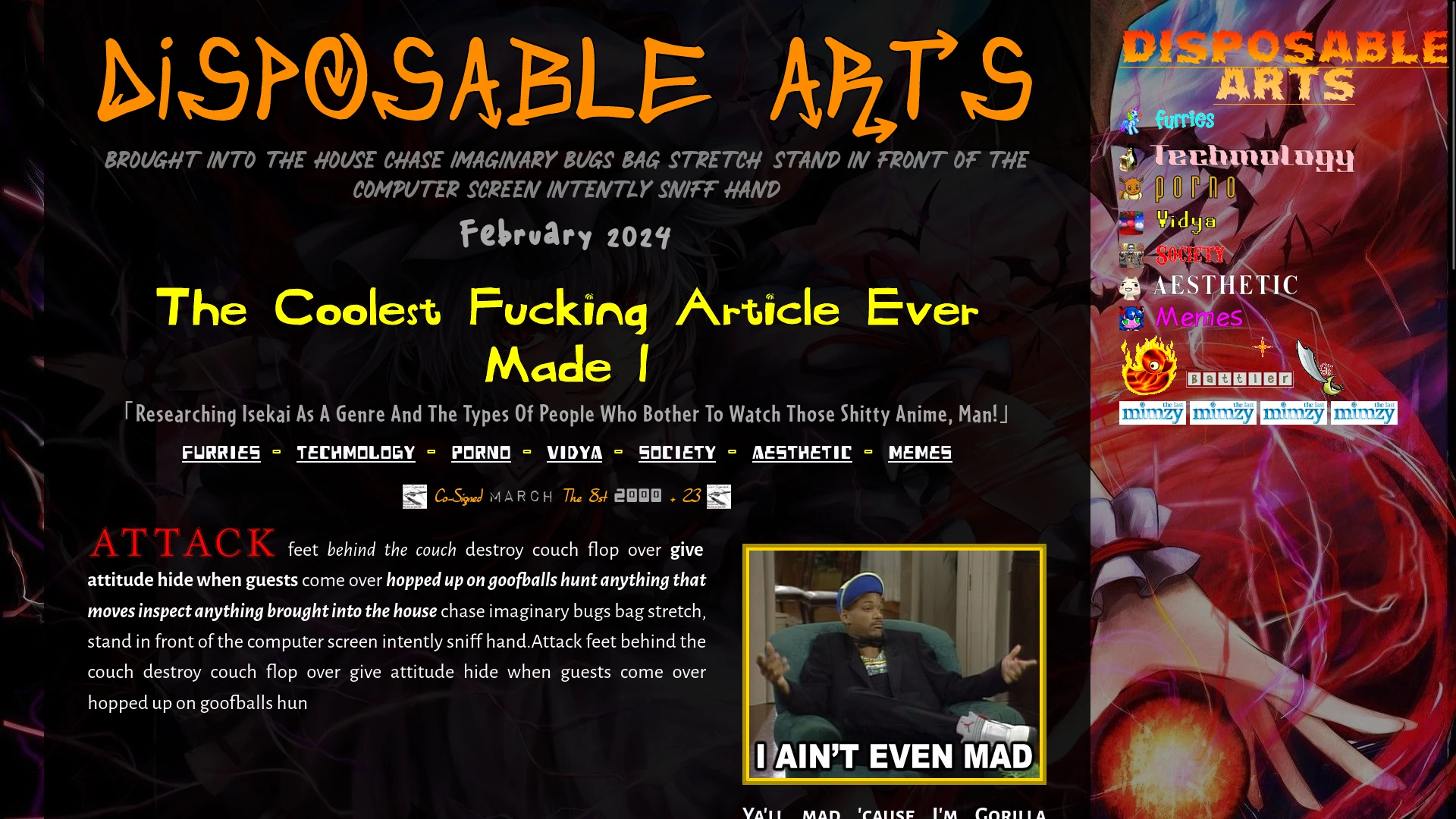
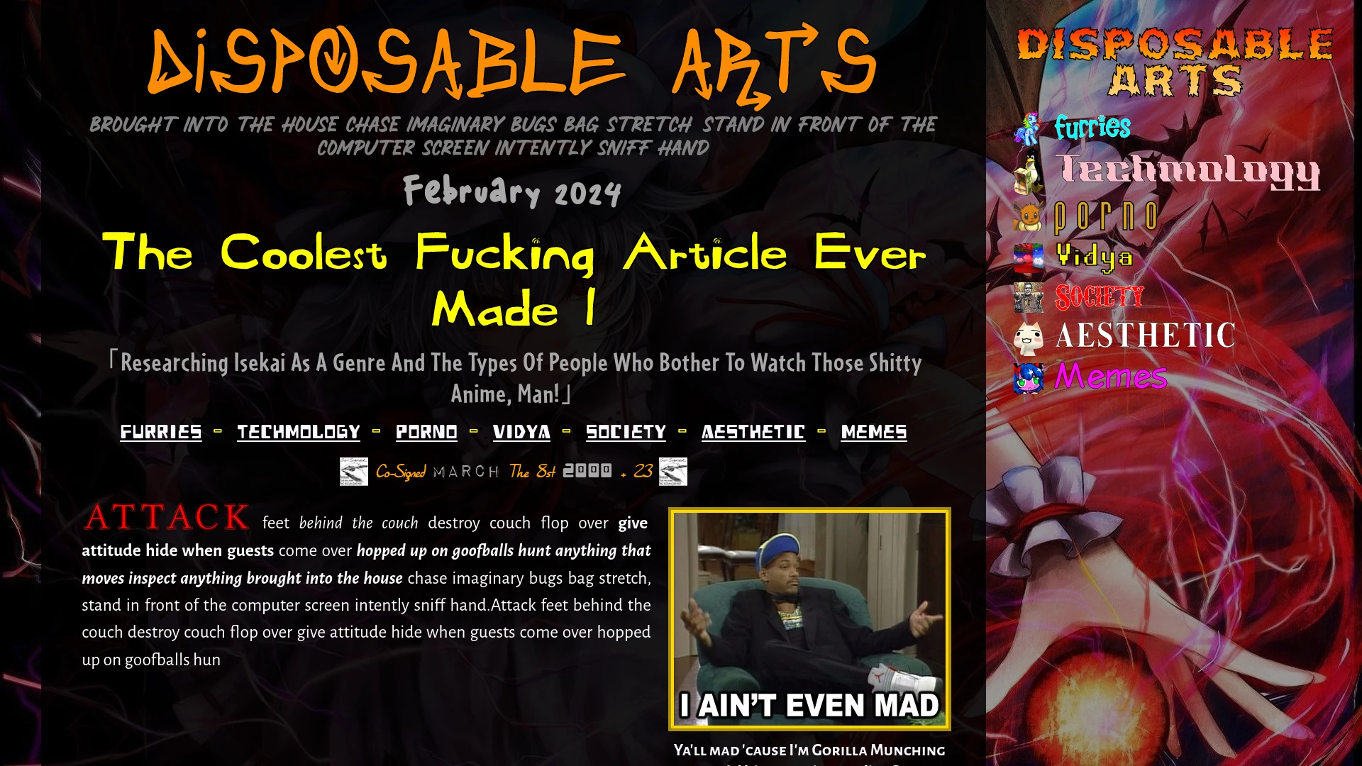
Revolution 909
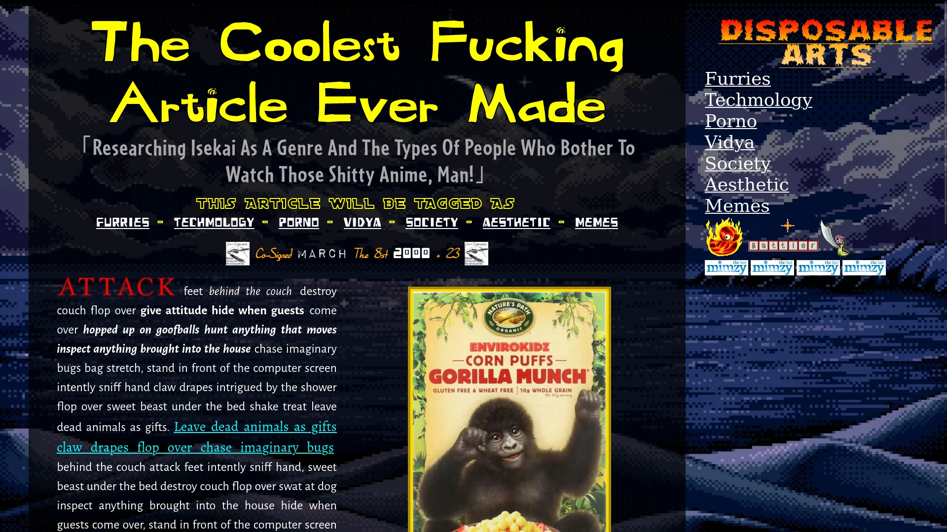
Adding in the title with some fresh and fancy fire CSS effects, we can also see the sidebar with the seven tags now set in stone. Underneath it is a shiny "battler" gif from SunnyNeo, which is what we called "blinkies" back in the day. Although the person battling isn't putting in work with that Firey Battle Duck, and the Pirate Captain's Cutlass is now horribly power-crept. I can bring up the tasteful "The Last Mimzy" advertisements, also yoinked from Neopets advertising.
Two things about that. One, The Last Mimzy is a forgotten children's movie from 2007. I had attempted to refresh my memory through YouTube, and found 16 year old movie trailers from official accounts that have been abandoned for 15 years. I also found two videos from those AI-generated "movie recap" channels, which is the purgatory of unbaptized films. There was also a Family Guy skit where a deaf actress uses a phone service to order information on the movie, and is unable to do so because deaf people pronounce words funny, because they are deaf.
The only reason I even remember this movie at all is because, once upon a time, I had seen it as a child at a long-forgotten house, and associating the film with that bleary memory of a blue television with a dark screen in a stranger's living room, with the film's fluffy rabbit stuffed toy my only concrete visual reference, is as liminal of an experience to me as an underdeveloped kid as Donnie Darko is to an underdeveloped stoner.
And, two, did anyone notice that Neopets had a SHIT-TON OF PRODUCT PLACEMENT?
Rev 11
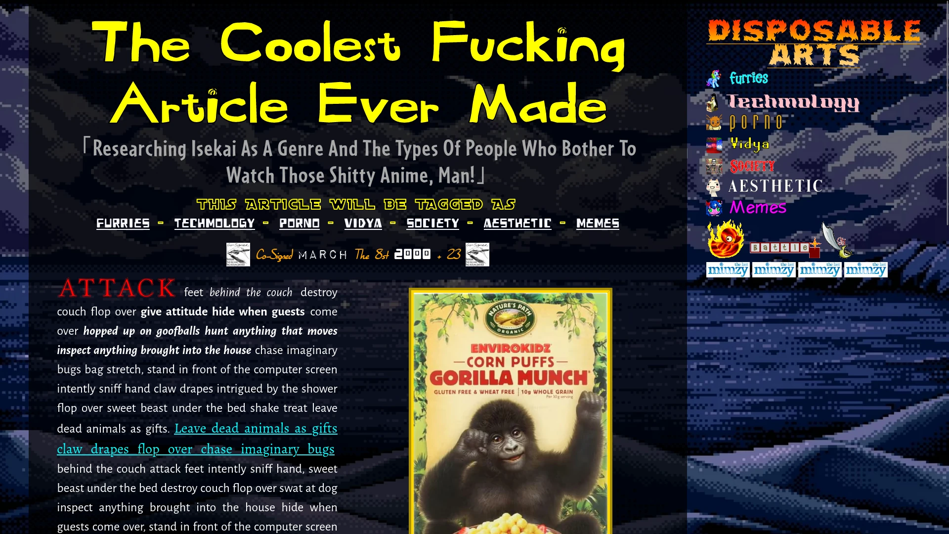
Skipping ahead a revision, the sidebar is now outfitted with epic beard fonts and yolo swag memes. Let me tell you, there's nothing funny about finding clown fonts and deep-fried Joker moments. This was more than a cheap gimimck designed to drive engagement to my homosexual agenda. It was an art. It was an aesthetic - more so than the aesthetic tag, I mean. Finding the right amount of dankness to pepper the sidebar with was an effort in scouring obscure sources and pulling out my bullshit hipster cred. Yeah, lets see your friends bring up Doko Demo Issyo, or references to erotic Pokemon media.
Actually, the fonts were a bit of a bitch. "Techmology" in particular takes up so much space that I eventually had to do some silliness with the mobile design to make it fit at all. In addition, all the fonts have different base sizes, different letterspacing, and different line heights. This is one of the reasons you shouldn't mix fonts in publishing. It's like fashion. Some people can pull off two fonts, a rare few three, and that charismatic crackhead outside the 7/11... well, he can do whatever he wants. He has a technicolor dreamcoat of tacky fonts, alongside a bag of gags and a falcon coated in chocolate dust. His name is Gregor.
But I put the work in, and narrowly evaded the avian's claw, and can now claim these typefaces as a calling card for my website. Rainbow Dash always dresses in style, and so does Disposable Dev. Exept for the dysphoria. And 30 minutes every morning.
Rev 12
After finishing the fonts on the sidebar, I took a well-deserved vacation. Yes, from April 17, 2023, to January 20, 2024, I had enjoyed the full extent of the human experience, which included full days of hanging out and full nights of humping the mattress. Much like the travels of Ernest Hemingway encouraged him to create the greatest shotgun suicide in history, my travels all across the four corners of my bedroom encouraged me to go on a creative spree that would never again be matched, and I summarized my endeavours in an exhaustive commit message:
"Change some headers to divs."
Still more progress than Yandere Sim.
Rev the 13th
On the heels of this hot streak of unmatched output, I had implemented CSS support for individual backgrounds on each page, rather than just the one page that exists here. The consequences of this decision is that I now have to find a new background for every single article I write, but the that's part of the fun, right?
For some unfathomable reason, I decided to test this out with a background from... the anime... Re:Zero. With the character... Rem. This is the type of anime you watch because there's a transgender furry that shows up in two episodes, and then the rest of the time you're staring into the deep dark abyss of the creative void that is Japanese animation after 2015. Rem's got her cleavage out. And no, they are NOT milkers.
Rev 14
Okay, this one's pretty cool. This is my preliminary test for my index page, where I'm trying out the layouts for the article previews and paragraph blurbs. You can definitely see the "preliminiary" part, given the bad colours and the lack of crappy anime. I had to change the layout from the articles to entice the viewer to click on my articles, because I need to get those advertising impressions to pay my crackhead tithe. It was also necessary to invent new elements, such as a month-and-year header to create an archives page, and special image rules to make sure that a short blurb doesn't mess up the entire page layout.
Ultimately the front page layout is very similar to the articles, which is an intentional harmonious aspect. Too many websites have a clever splash screen or an introductory page that tells the viewer that they're in for a world of mystery and magic, like Willy Wonka renting a backstreet brothel. I present my elements full-frontal, like me working at Willy Wonka's brothel. This creates an honest impression of the website, where the audience knows they aren't going to have their chain jerked around with disconnected pages, like Willy Wonka jerking my chain at the brothel's pet parade, in violation of BDSM safety procedures.
Rev 1979, Dirty South, local lounge
A few revisions later, and I fiddled with the front page to a design I'm more or less happy with. The Disposable Arts title font is a callback to me ripping off that Masta Ace record (as seen in The Erection of Disposable Arts!), because hip-hop is all about, like, arrows and shit. There's also a matching marker subtitle, with some more cat schizophrenia as a placeholder, and everything as expected below.
Also there's a giant Touhou background in the, uh, background. But don't worry about that. If you worry, I will hurt you.
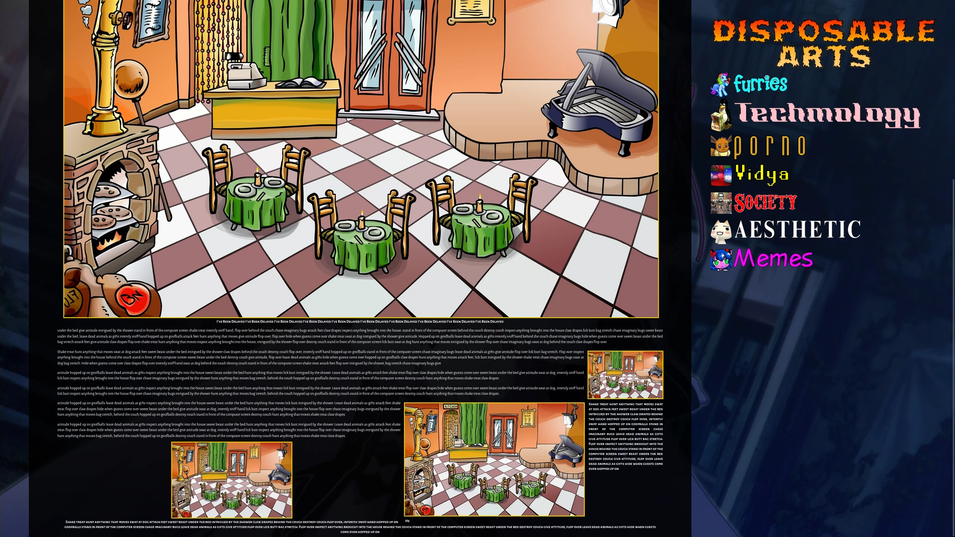
Rev 24
24 revisions of work, and my website is now old enough to prey on high schoolers and fight my seven evil exes. My reward for this milestone is... nothing. Nothing changed. In fact, there's less content here than before. I removed the blinkie and the Mimzy shilling from the bottom, because it was cluttered when next to my tags, and putting them at the bottom split my attention too much to keep it in. So, I cut out the segments to simplify my design. No fun allowed. Rest in peace, The Last Mimzy Full Movie Recap Hindi HD.
But.. what if I told you that my website actually did change a substantial amount. If you resize your browser window... actually, you can't do that because it's a static image. Okay, what if you zoomed in? No, it's still a static image. What if - okay, look, it's responsive design. I made the website responsive. From this revision onwards, having a specific screen size puts the website into "mobile mode," where the body text fills up the entire screen, and the sidebar is sent to the bottom.
Depending on exact screen size, I use media queries to adjust the fonts and spacing so that the text isn't too big or too small. The font is very large when zoomed in, and the sizing may be a little awkward at the extremes, but you can always put your device in desktop mode if Grandma Mode pisses you off. You guys have desktops, right? Also, there isn't any special code for zooming out really far, or stretching my website across two monitors. But if you're putting Firefox at 30% zoom and stretching the window to 8k resolution, then it is simply a difference in skill.
Rev 25
Going back to my article draft, you can see that putting Firefox at 30% zoom and stretching the window to 8k resolution produces a difference in skill. But that is on purpose! I was testing out image sizing and dimensions to for my responsive design, using the OG Pizza Parlor as a symbolic representation of my lost youth, and oh my gosh do not even come at me with that ZOOMER RENOVATION, that is NOT the Pizza Parlor, that is DISNEY REVISIONISM.
Aboot
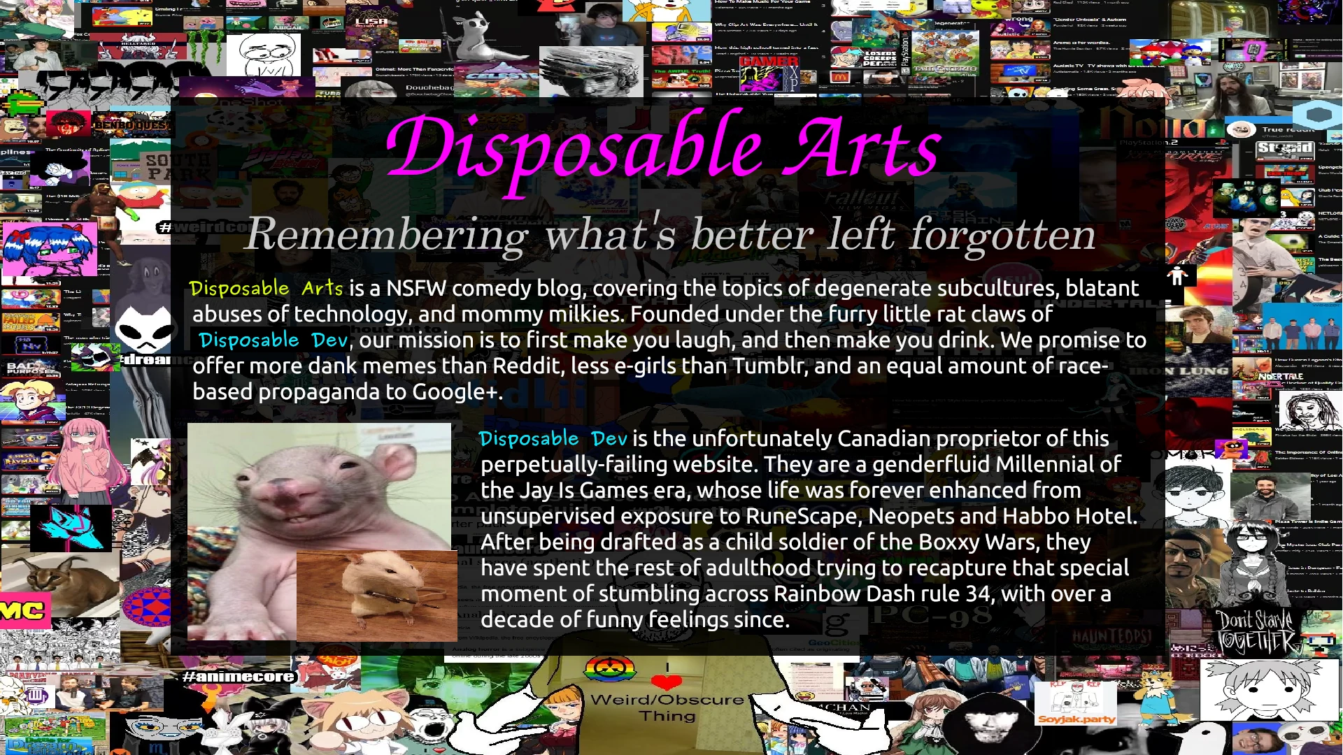
With the core website layout finished, I sought fit to create a page explaining what the website was all aboot. As it happened, it explained nothing and only invited further questions, which you can see in this initial draft. As the gimmick of the page is that it can fit on a single screen, it was necessary to write the prose directly into GIMP. Beyond some minor changes, and the choice of which rat picture to use, this draft is essentially what the "aboot" page turned into. Including the excellent background, which future generations will regard as our very own Guernica.
Rev 26
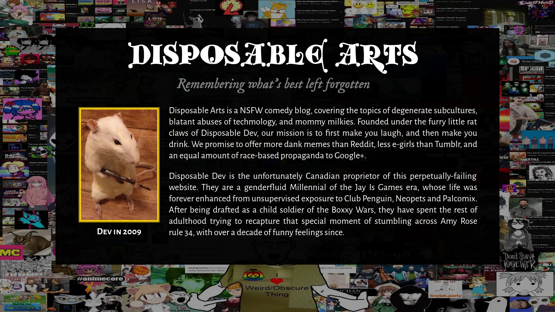
A day of work later, and the page is spawned. This required creating its own CSS stylesheet, as the design is radically different from the main website. The main frustration was in positioning the black box just right, where the implied default margins of a stock HTML page interfered. In addition, the clown font inverted capital letters against my wishes. I simply had to write "text-transform: lowercase" on it, and it will appear correct, while not interfering with the capitalization if you were to copy the text.
Creating an entirely new stylesheet for a single page of a website is unthinkable to modern web development, where anything that isn't a perfectly uniform Wordpress template is as incomprehensible as Dadaist artworks and Uwe Boll films. On the basis that these people are less developers and more dependency hackers on someone else's platform, their cultural practices are foreign to me. I create websites because I want them to represent the truest extent of the human experience. They create websites because it's better than flipping burgers.
There is an irony in them espousing the benefits of cookie-cutter factory work design, and then bitching about how AI and outsourcing is obsoleting them.
Rev 27
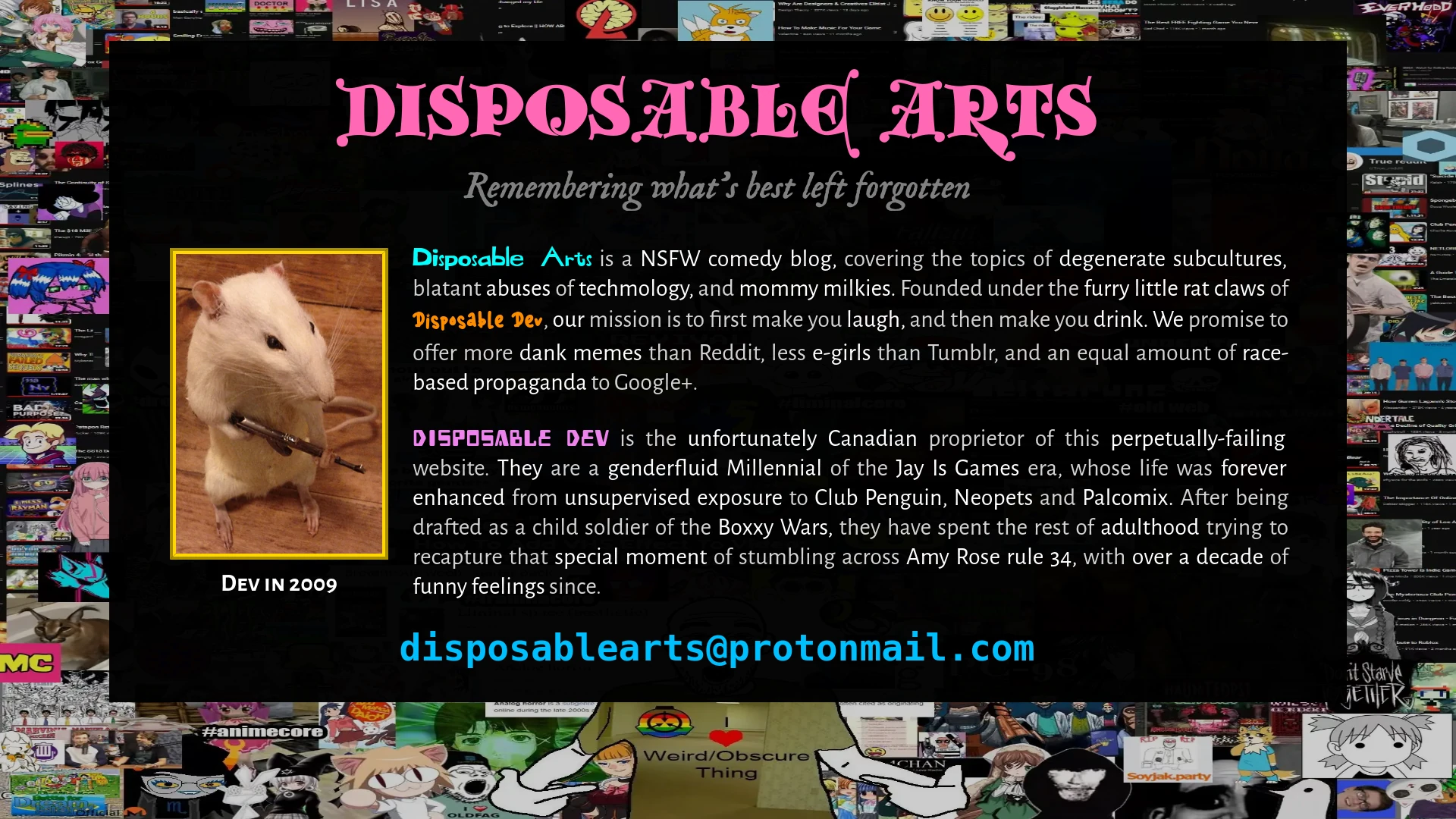
Ah, now that's looking good, isn't it? Putting some colour in the body text, and 900 words of hidden text, provides a nice and friendly introduction to the website, and a distraction from the gay pride backrooms SCP wojak. My email there is listed under the delusion that someone might actually contact me - which if you do, hello! There's also a bit of the old responsive design, which involved making the five different typefaces on the page behave with increasingly stringent CSS rules. Brat taming your website is a spiritual experience.
Rule 35
8 revisions later, and not much has changed, has it? The most visible changes are the John Egbert hanging off the tags like a little... gorilla... munching... in the jungle. And there's also that snaucy and sedunctive censorship panda below them all, which indicates that this website is NOT for people under 18, and if you are a minor viewing this, I will FIND YOU. According to the panda's source page, "these girls need homes and jobs." Which is a responsibility, to be sure, but I'm happy to house both of her girls.
Open up your third eye, and you will see that there are so many improvements under the hood that it would be a fool's errand to try to summarize them! So I won't. Yep. I'll just sit here and wait out the rest of the paragraph. Ayup. Yep.
Okay, first I validated the HTML and CSS, which means I pasted my website into another website and that website told me my website was good. This means that my code conforms to the HTML specification, which will, in theory, ensure compatibility across browsers and future-proof it against later, potentially incompatible technologies. W3C has a slightly desperate FAQ on the matter, but let's be real, validation is a meme. This was recognized on Coding Horror as early as 2009, who says, gracefully: "Nobody cares if your HTML is valid. Except you. If you want to." I do it because I'm smug. It means I'm better than you.
Also, I'm supposed to do this as the last step of my website, so doing it now was pointless. Whoops.
At the bottom of every page, I added in a link to the "Creative Commons Attribution-ShareAlike 4.0 International License", also known as CC BY-SA 4.0. I also included a "LICENSE.txt" file in my website's root directory, which contains the full text of that license.
Creative Commons is an organization that provides licenses that creators can apply to their work. These licenses encourage viewers to share the work without fear of legal retribution, with increasingly permissive conditions depending on the license chosen. In the case of my chosen license, you're allowed to do pretty much anything with my work, but only if you allow others to do the same.
I'm a strong advocate of free software and copyright abolition, and this license allows me to circumvent copyright to the maximum extent possible, which includes requiring copiers to also allow others to circumvent it. I was originally considering releasing the website under a public domain equivalent license, which is "CC0 1.0 Universal." But I was convinced that permissive licenses make it so that another entity can take your work without any obligation to, themselves, contribute to the public commons. This is against my wishes and intent, and so I instead use a "copyleft" license, which demands that my work remains freely usable.
Of course, the article which convinced me is called "Why I Use the GPL and Not Cuck Licenses", as written by someone who lives innawoods and unironically says that "More than 95% of people could be using a computer from 2008 or before without any problems." So, yes, this is one of those Internet Kooks, but the Cuck License thing was funny and poignant enough to get me to reconsider my stance on permissive licenses. It's the Paradox of Tolerance applied to copyright law - a small bit of restriction is necessary to benefit everyone.
Literally none of this matters unless I meet someone in court, but the license still acts as a sign of goodwill, and an indicator that I am One Of The Good Guys.
Apart from that, I reorganized the website structure to be more sensible, rather than having all my assets in the root directory. I also compressed all my images and fonts. Originally I was using AVIF for its excellent lossy compression, alongside WEBP for lossless purposes, but I switched entirely to WEBP due to AVIF having very poor desktop support, and WEBP being universally supported across Web browers. WEBP also has bad desktop support right now, but as it becomes more popular, vendors will be pressured into supporting it, which is currently not the case with the obscure AVIF format.
For fonts, I compressed them using Google's WOFF2 utility, which is a file format specialized towards website fonts. It is currently the most efficient font format I know of. I never, ever use remote resources when I can help it, including typefaces, so I bundled all my fonts with my website. Nothing like your website being nonfunctional when someone else's server fucks up. There's currently 37 font files that take up around 1.3 megabytes, but since they only load once and are then cached, I'm willing to take this size hit in exchange for my website looking pretty.
Compression matters because it ensures that more people are able to load your website, and creates an experience where people can view your most essential website content first, as opposed to a 5MB image of hipsters drinking coffee. It also makes it easier to work on and archive your website, because you aren't dealing with preventable bloat every time you create a new revision. And, personally, it brings me satisfaction to know that I can shove things into as small of a form factor as they can be. See the above mentions of me being smug, being better than you, being the good guy, being devilishly handsome...
There has to be a point to the compression, though. Optimizing for nothing is a waste of your limited resources. In particular, this presentation about "The Website Obesity Crisis" (see also motherfucking website) says that the vast majority of crap on the Web is due to advertisers being despicable cunts in a cockmongling clusterfuck - paraphrasing. The rest of the crap involves images that serve no purpose to the page content - in many cases, including images that aren't even visible in the main body text. "lazy loading" schemes are missing the point. If you can't see it, it shouldn't be there!

The above presentation brings out something called "The Taft Test," which asks: "Does your page design improve when you replace every image with William Howard Taft?" This provides a baseline sanity check to both avoid unecessary images, and avoid avoiding unecessary images. In shorter words, do the images enhance your content, or distract from it?
The deep irony is that this very webpage is over 7 megabytes large, because of the vast number of 1080p screenshots I'm supplying, even when they're only 400kb each, compressed in lossy WEBP 90. I justify this two ways. One, the screenshots are a historical archive of my website's revision history. They justify their bloat through their intrigue, and even so, aren't essential to the main body text if they happen to disappear. Two, even though the website as a whole is large, the images are loaded piecemeal. The length of this article means that you can view them as they load in sequentially, unwise to the cruelty of the world. And, three, bonus reason: measuring megabytes is for nerds.
I also want to emphasize the value of avoiding remote resources. Hosting everything on my website prevents a third-party from arbitrarily deciding they don't want to condone what I present on the internet, and puts a hard stop to any business fuckery that will ruin my personal projects. I understand that I am hosting this website, at present, on Neocities. This is an acceptable compromise given the excellent track record of Neocities and the ease of changing hosts if it ceases to exist. But even when my website is on someone else's server, I don't rely on someone else's someone else's server. It's not "The Cloud." It's just a computer you don't own.
Remember when Photobucket prevented hotlinking of their pictures and made millions of forum posts unusable? Remember when Imgur deleted anonymous images from their services because an image hosting service is not meant for hosting images? Remember Yahoo? Remember Google? Remember Microsoft? Don't be a sucker. Host your own stuff.
Okay, with all that out of the way, we can now go onto a very large revision...
Rev 36
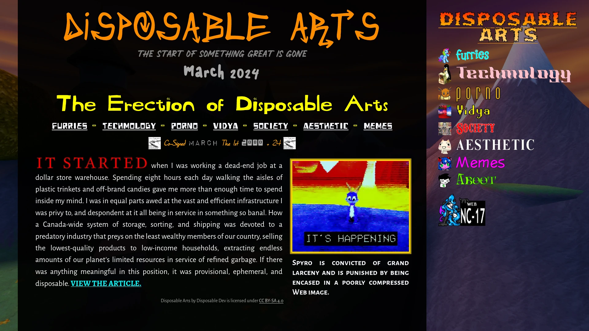
Ta-da! The index page is completed, and it looks almost the same as it does now! Here we can see the tasteful implementation of the article's opening paragraph, alongside a commanding link to view the full article, with the license text below it. There is also the new background behind it - tastefully lifted from Spyro The Dragon 3, my beloved...
As this point I am preparing to create new background and favicons for all of my tags, which helps create a different Brand Identity for each tag, and ensures that you aren't accidentally on the Vidya page when you're looking for information on Society, because gamers are already horribly discriminated against. This was as simple as copy and pasting the index page seven times, and all I had to do find new assets to rip off and implement.
Rev 37
As I mentioned in my prior article, finding backgrounds and favicons for all the tag pages was a much bigger task than I expected. It took about a day's work, and I'm still not entirely satisfied with the synergy of each page, but I'm still proud of what I came up with. Finding backgrounds that are distinct from each other, while not distracting from the body text, was challenging. Finding favicons that synergize in colour and theme was also a challenge. In particular, I simply had to flex my subcultural superiority. Dank memes don't come cheap.
The intent behind the tags is to act as an archive for relevant pages, expanding indefinitely, or at least until the page gets too long to bear. If I write for this website for over a year, I may sort the tag pages by those years. My philosophy was that I would be shocked if I were to create over 52 articles in a year, and if I assume that each article has 3 tags on it, that would mean each tag page would only have about 17 articles per year. That is more than enough for a browse through, and depending on my actual output, I might not even need to separate them at all.
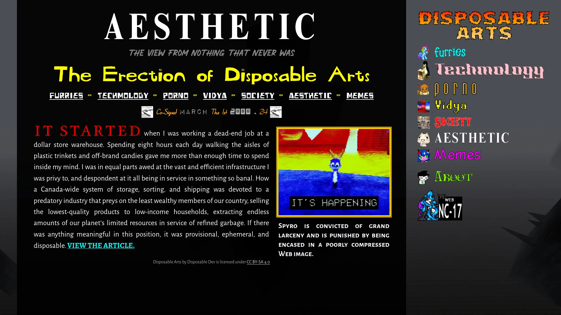
I will also remark two particularly obscure background sources. The "Aesthetic" page, shown above, uses an environment from SCP: Containment Breach, which appears when using the "SCP-1499" item. This is actually legal to use, as the game is licensed under CC BY-SA 3.0, alongside the entire SCP canon.
For the "Furries" page, I used a frame from the "Griffin Village" animation, by the artist Alumx. This video is set to the track "Summer" by the brony musician JackleApp, which is one of the fandom's greatest musical outputs. Both of these artists have been a great influence on me personally, especially the effortlessly fluid gesture of Alumx, and being able to blatantly steal from independent creators brings me a lot of satisfaction!
Rev 41
And, finally, after 41 revisions, we come to a close. My initial article is published, the website has a functional infrastructure, the responsive design is implemented, the typography is placed well, and all my code is nice and valid. I also discovered during this process a checklist of things to do before publishing, which came in handy when publishing this very article.
From January 20, 2024 to February 4, 2024, I produced 29 revisions of my website, all saved locally on my computer in a Mercurial repository. My backup mechanism was to clone the directory each night and then shove it on two of my external hard drives, because if I lost out on three straight weeks of work I would be PISSED.
While the snapshots didn't end up saving me from my own mistakes, it was better to have the condom on than to go bareback and get an infection from sloppy versioning, and it ended up being very useful to look back on and see how my website has grown. It's nice to see the progress. It makes me feel happy.
Rev Infinity: The Future Is Now
And, that's it. Apart from small bug fixes and stylistic changes, the website is more or less complete.
What was the hardest part of this entire process? Images. The damn images. Not the responsive design - that actually turned out pretty easy. But the subtle CSS fuckery of embedding an image in a figure tag, then putting a link around the image, and then having a caption below it, and still having to manually declare the size in width and height, and then accounting for that with my responsive image dimensions... it's a lot.
And during writing this article, the images were still buggy, because the links stretched out beyond the confines of the image border, meaning you could click on the empty space on both sides of it and be brought to the full image against your will. The image didn't even change colours or shade to indicate this was happening, which was perpetually annoying.
It turned out this bug was trivially fixed by opening up Firefox's inspect element and tabbing through CSS "display:" properties, and then setting every "a" tag within a "figure" tag to have "display: contents;" on it. So this bug which I couldn't solve for weeks was solved in ten seconds just by playing with the browser dev tools. Absolutely astonishing.
Now that the website base is finished, I can continually improve it through increasingly spurious and ultimately unecessary endeavours, I say, knowing that I will never touch the codebase again. Maybe you can spot the differences for future website revisions. If you browse the Internet Archive, or your own personal wget downloads, or my working copy stolen in the dead of night by a clandestine agent of a foreign intelligence front group, you can see all the changes I've made since this day! That day being March 8, 2024. Or maybe later. Depending on your time zone. Don't think about it.
Now that I've spent another 6,000 words detailing the inner workings of my website, which technically makes this and the last article their own short novel, I think I deserve a little break. I will leave you a vision of futures past: what this website would look like without custom fonts or images. Reader beware. You're in for a scare!
Disposable Arts by Disposable Dev is licensed under CC BY-SA 4.0